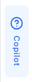
Edge Trigger
The edge trigger is a slim vertical tab that appears on the screen edge and opens the co-pilot panel when clicked.
Basic Configuration
examples/guides/edge-trigger/basic-config.tsx
<PillarProvideragentSlug="your-agent-slug"config={{edgeTrigger: {enabled: true,},}}>
Options Reference
enabledboolean
Whether to show the edge trigger sidebar tab.
When enabled, a slim vertical tab appears on the screen edge that opens the panel.Defaults to
true.resizableboolean
Whether the panel can be resized by dragging the edge of the sidebar trigger.
When enabled, a drag handle appears on the inner edge of the sidebar when the panel is open.
The resized width is persisted to localStorage.Defaults to
true.Position
The edge trigger position follows the panel position. If the panel is on the right, the trigger appears on the right edge of the screen.
examples/guides/edge-trigger/panel-position.tsx
config={{panel: {position: 'right', // Trigger will be on the right edge},}}
Disable the Trigger
Hide the edge trigger and control the panel with your own custom button:
examples/guides/edge-trigger/disable-trigger.tsx
<PillarProvideragentSlug="your-agent-slug"config={{edgeTrigger: {enabled: false,},}}><CustomHelpButton /></PillarProvider>
Then use the usePillar hook to control the panel:
examples/guides/edge-trigger/custom-help-button.tsx
function CustomHelpButton() {const { open, close, toggle, isPanelOpen } = usePillar();return (<button onClick={toggle}>{isPanelOpen ? 'Close' : 'Help'}</button>);}
Behavior
The edge trigger:
- Shows sidebar tabs configured via
sidebarTabs - Stays visible when the panel opens (shifts with the panel)
- Reserves space in the layout (push mode)
- Automatically syncs with your app's theme (light/dark)
Next Steps
- Human Escalation — Add support tabs to the sidebar
- Customizing the Panel — Configure the panel the trigger opens
- Theming & Branding — Customize the trigger's appearance